http://www.flickr.com/photos/geminicollisionworks/2108838790/
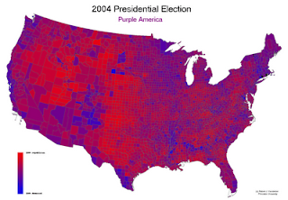
Unclassed Choropleth maps are a lot like classed Choropleth maps, except with unclassed choropleth maps they don't show average statistics for every color interval. It allows us to have a better idea of the numerical relations between the data in certain areas. The shades of color are proportionally true to the data of each area. This Unclassed Choropleth maps shows the difference in democrats (blue) vs republicans (red) living in the United states. You can see that most places aren't a solid red or blue but a mixture and that because most states are not fully democrats or republicans.

No comments:
Post a Comment