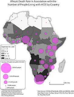
Proportional Circle Maps use circles to represent the portion of a value of data on a map. The larger the circle is the higher the value. The same goes for if its smaller, then the data is smaller. This map show the number of people in africa living with HIV/AIDS and how many live in certain areas. You can see how the map displays the big circle at the bottom to show the higher population of aids.
No comments:
Post a Comment